2019 NHL All-Star Game Jerseys Unveiled!
- Admin
- Jan 10, 2019
- 2 min read
A very different approach was taken this year for the 2019 NHL All-Star Game jerseys. First, even though there are four teams, there will only be two jerseys - one white and one black (nooo!).
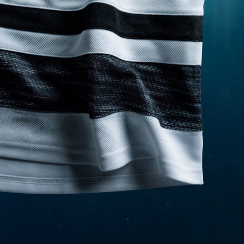
Second, the two jerseys are mostly just black, white and grey (boring!). For the grey striping, they brought back the heathered pattern last seen on Team North America's 2016 World Cup jerseys.
Also, the NHL partnered with Parley to create these jerseys out of recycled plastic from the ocean (that's cool but the jerseys look exactly the same to me...).
Finally, for the first time in NHL All-Star Game history, the jersey's crest will not be either the NHL logo or the All-Star Game logo. Instead, each player will sport his NHL team's logo on the front of his jersey, recoloured to black & white.

Here are the both the white and black jerseys for every team!


And there they all are!
I like the idea of each team's logo being the crest and I see how it would only make sense if they were all black and white. However, I think if they added some accent colours to the jersey it would improve them a lot. It will be pretty bland to the eyes when we all watch the game this year. Heck, you might as well pull out your black and white TV's to watch it! Anyways, if they just added some bright teal or orange in places, it would help.
Having said that, these jerseys will probably sell better than past All-Star Game jerseys since each team basically just added two more jerseys to their set. The Kings could literally use both of these as their new alternates! This might actually be the perfect jersey for someone who would like to represent their favourite team without standing out too much.
The whites are definitely better than the blacks. My favourite is the New York Rangers' jersey since we never get to see their primary logo as their crest (it's usually the word "RANGERS" spelled out diagonally. Other good ones are the Capitals, Blue Jackets and Senators because I like the traditional striping over their current ones.
Overall, I'm pretty disappointed by the end result. I would prefer four different jerseys so that each division would have their own identity. Plus you don't know which jersey your team's player will be wearing (they may even wear both). I also definitely wish there was more colour than just the teal on the inside of the colour (which actually isn't even visible when worn). The only thing that is pretty cool is that each player will have their team's logo as the crest of their jersey.
What do you think? Which jersey is your favourite? Will you buy one?
Let us know in the comments below!


