


The Florida Panthers unveiled their 25th Anniversary logo today and it was done very well. They managed to incorporate a lot of team & city history into this one little logo!
They actually will have two versions of the same logo - the red one for their home jersey and the white one for their away jersey.


A metallic-stitched version will be placed on the front-left of their jerseys.


Now for the intricate design elements...
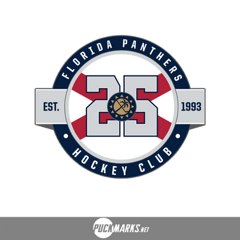
A version of the fan-favourite sun/palm tree shoulder patch (mixed with the icon from their current jersey patch) will be brought back front and center on the logo.

They included the crossed stripes in the background to tie in the Florida state flag.

The roundel and lettering style is pulled from their previous third jersey logo.
Lastly, "Hockey Club" is pulled from one of their original logos!

Whenever a designer can include that much history into a logo, it's a home run! I give it 10/10!
And we'll end off with a chrome version of the logo also released...

Share your thoughts in the comments below and see all of the other 2018-19 anniversary logos here.